SPBH SPEAKERS CORNER
Self Publish Be Happy
Speakers Corner
at OFFPRINT, Tate Modern London
24 may 2015
For the talk at the Speakers Corner A Corner With founder Trine Stephensen walked around and asked the people working in Ridley Road Market for their opinion regarding the newly launched A Corner With publication Sculptural Geometry. And here is a summary of their review of publication:
In general the pictures are quite nice, they are quite different. they do remind me of pictures you see on an office wall, or when you go to a solicitor or your GP or something. Is this for school kids or something? I can see shapes and sizes, the images themselves are alright, one is quite retro. And another is missing the depth of field, that is a mistake, a huge mistake. I like to play with shapes as well. I like shapes. Different shapes. Doesn’t matter what kind of shapes. Some of the shapes would look nice as a pattern on a dress. I like bright colours. Nice bright colours; I like the colours because its bright. but I would prefer to see more cubes, it is missing a few cubes. Where are the cubes? I like cubism, abstract. I used to do this years ago. I am easy to please, trust me, I am not complicated. More cubes would be more interesting. Some of the objects in the images remind me of things you can buy in a DIY shop. One of the pictures there reminds me of tomatoes on a plate, but I presume it is That’s my instant thought. The images with circles make me think of the world and the sun, and their reflection; the reflection towards each other. One of the picture is destroyed by graffiti, that annoys me. I am asking myself, ‘why would you do so?’ The blue image has a good use of the space, it’s a good reflection, down to the bottom. Visually strong. Wow and there we have a chopstick. A chopstick. The photographs are crazy, they’ve all gone crazy. This is crazy. It really can hypnotize you. It really can. It’s different man, but ohhh they hypnotize. There is one picture I wouldn't mind having. Some of the images are quite clever, some with very simple shapes but it doesn’t take a lot of concentration to see the shapes. I like shapes. I hope to one day see them on my GPs wall.
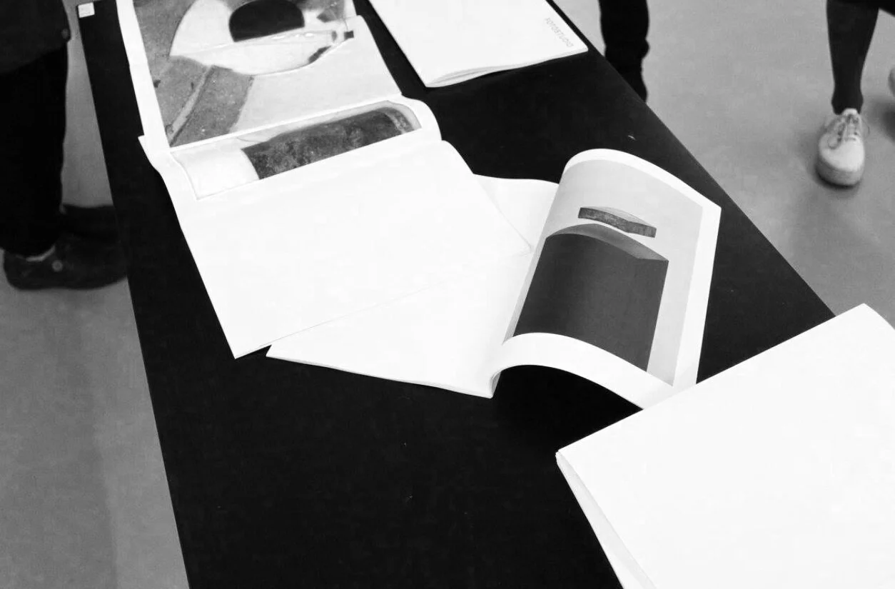
Images of the publication in the hands of the reviewers in Ridley Road Market:


